

project spotlight

the 1 of 20 podcast by jonathan cappiello
The 1 of 20 Podcast is a storytelling and advocacy platform created by Jonathan, a rare disease patient and advocate, focused on sharing lived experiences, education, and awareness.
The project centered on developing a cohesive brand identity and supporting social media system that would feel personal to Jonathan while remaining professional, recognizable, and easy to maintain long-term.
branding, identity & social media
The goal was to create a brand that felt both meaningful and visually distinctive, balancing emotional depth with a refined aesthetic. The direction combined unexpected influences—blending a soft “old money” and coastal visual tone with more symbolic, advocacy-driven elements.
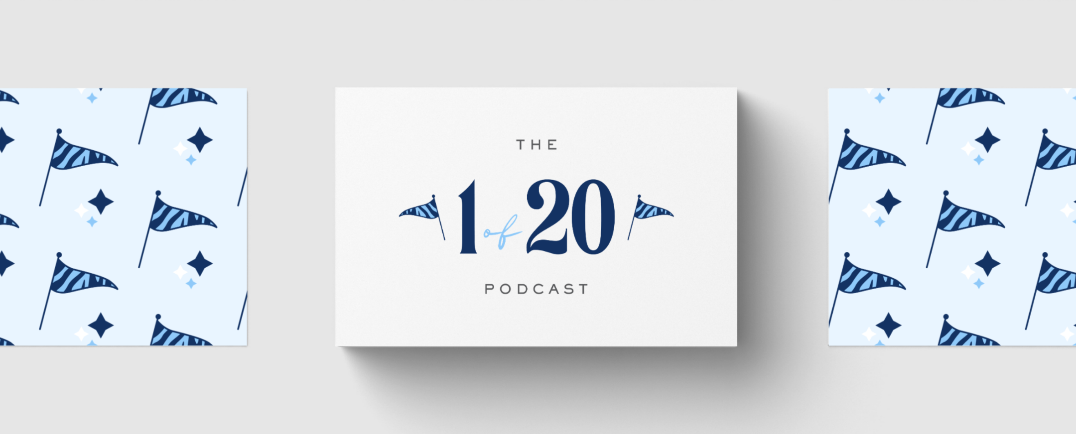
A key requirement was the integration of the zebra motif, a widely recognized symbol within the rare disease community. This became an important grounding element in the identity, adding both significance and recognition.
The final brand system included:
Primary logo and supporting lockups
Refined visual identity system
Cohesive brand direction and styling framework
Alongside the brand identity, I developed a set of social media templates and podcast episode artwork systems designed to simplify ongoing content creation. These templates were built to:
Maintain consistency across platforms
Make episode publishing easy and repeatable
Support storytelling without overwhelming design constraints
Allow flexibility for quotes, guest features, and awareness content
The system ensured that Jonathan could focus on content and advocacy while maintaining a strong, cohesive visual presence across his channels.
This was a highly collaborative project shaped by ongoing exploration and iteration. Jonathan came in with a strong vision, and the process involved refining and testing multiple directions before arriving at a system that felt aligned with both his goals and the podcast’s mission.
A key focus throughout was building something that would feel like “home” for the brand— emotionally resonant, sustainable, and easy to evolve over time.
The final identity brought clarity and cohesion to the podcast’s presence, unifying branding, social media, and episode design into a consistent system. It elevated the visual experience while staying grounded in accessibility and meaning.
The templates and brand structure now allow for seamless content updates, helping the podcast maintain consistency as it continues to grow its audience and advocacy reach.