

project spotlight

green mountain coffee packaging design
Packaging is often a customer’s first interaction with a product—it communicates brand identity, builds recognition, and ultimately influences purchasing decisions.
In this project, I reimagined the packaging for Green Mountain Coffee, aiming to modernize its visual identity and create a more compelling, cohesive shelf presence. While the product itself is well-loved, I saw an opportunity to elevate the brand through more intentional, contemporary design.
Key Skills Demonstrated: Packaging Design, Dieline Creation, Typography, Branding, Print Production, Iterative Prototyping
ideation + concept
As my first deep dive into packaging design, I focused heavily on understanding both form and function:
Studied color systems, typography trends, and competitive packaging in the coffee market
Learned the fundamentals of dielines, layout, and production through tutorials and hands-on experimentation
Sourced and analyzed packaging mockups to ensure realistic presentation
To fully understand structure, I physically reverse-engineered a coffee bag— cutting, measuring, and rebuilding it— to create an accurate dieline in Illustrator. This hands-on approach helped bridge the gap between digital design and physical production.
concept development
With a strong research foundation, I explored multiple visual directions:
Developed a green, pink, and cream color palette to feel fresh, modern, and eye-catching while still nodding to the brand name
Created several logo concepts, each paired with its own graphic system
Explored a range of styles— from clean and geometric to more playful and illustrative
Designing logos alongside supporting elements allowed me to build fully realized concepts rather than isolated ideas, making it easier to evaluate and refine each direction.
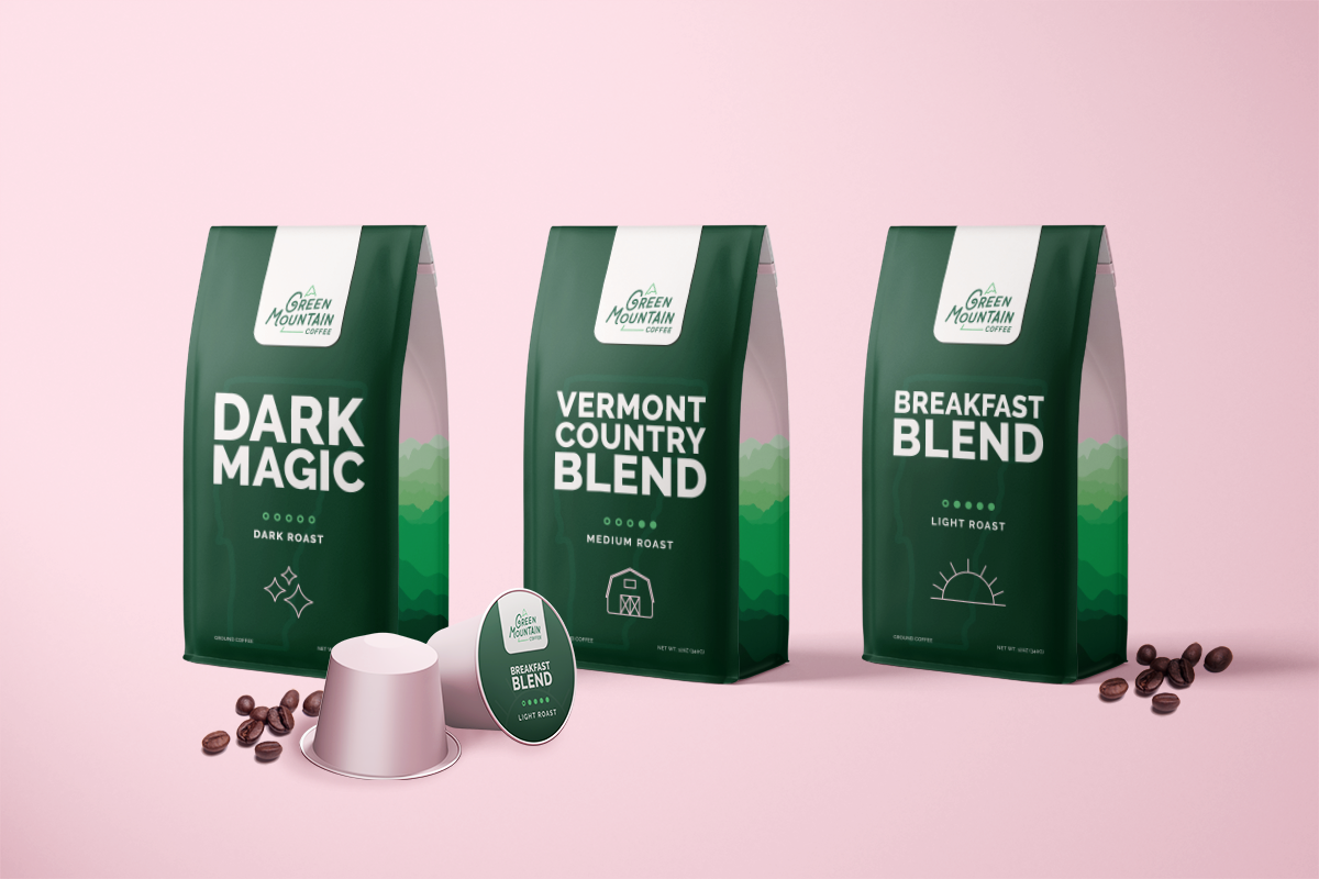
final design
The final concept blends bold typography with custom illustration to create a distinctive, modern package:
Visual style: Clean, contemporary typography paired with expressive graphic elements
Color strategy: High-contrast design using a dark base with vibrant accents for shelf impact
Structure: Custom dieline translated into a fully assembled, physical prototype
I printed and assembled the packaging multiple times, refining scale, spacing, and layout with each iteration. This process strengthened my understanding of how design translates from screen to physical form.
reflection
This project marked my introduction to packaging design and quickly became one of my most impactful learning experiences. It pushed me to think beyond visuals— considering structure, usability, and real-world production.
It also sparked a deeper interest in packaging and physical design, influencing my continued exploration of print, product, and brand experiences.