project spotlight

frutiger type specimen booklet
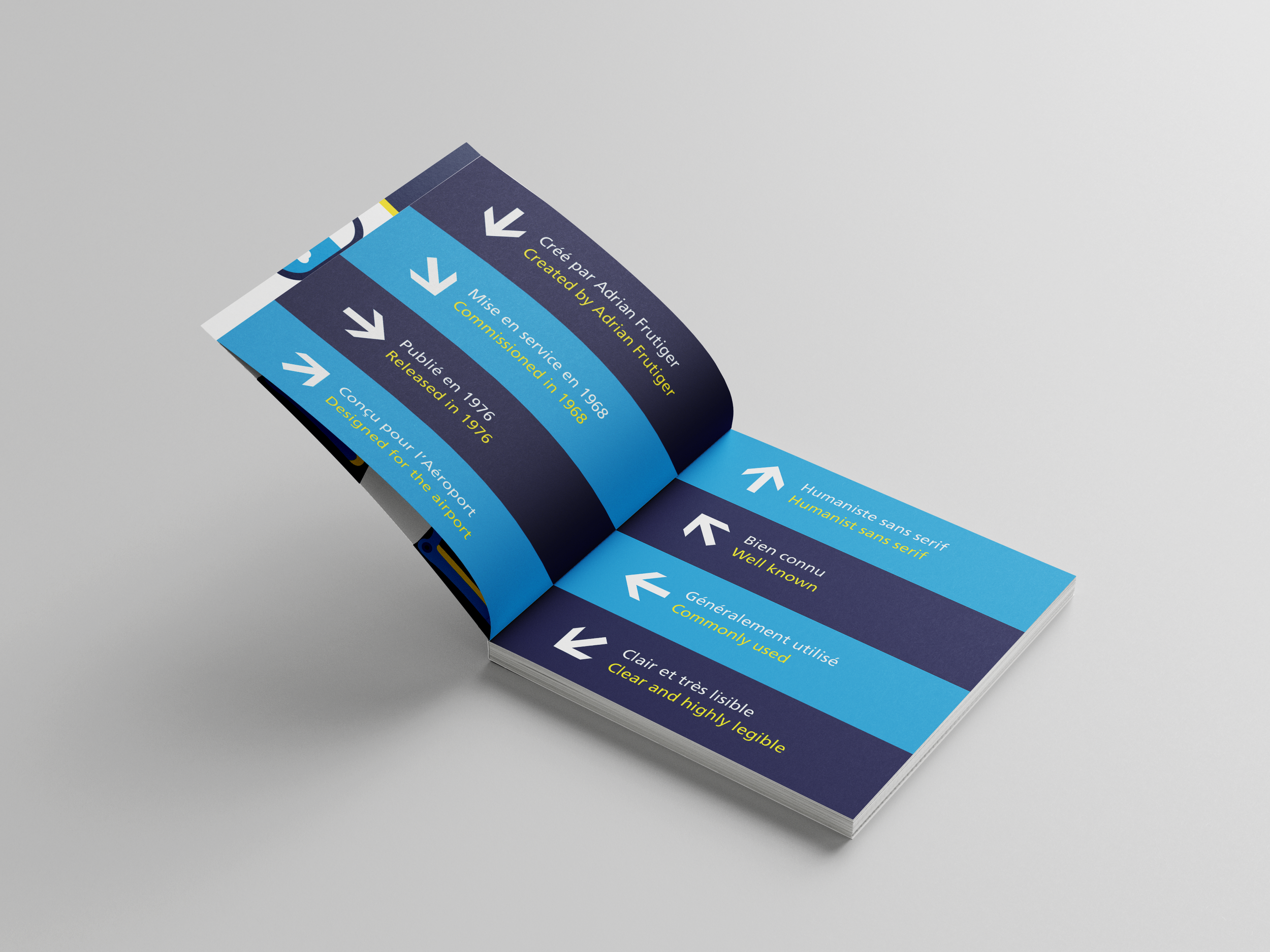
The Frutiger typeface, created by Swiss designer Adrian Frutiger in 1976, is a humanist sans-serif known for its exceptional legibility at both small and large scales. This project explores the history of the typeface while presenting it through a visually engaging printed booklet. Completed as part of my design coursework, it’s a prime example of my skills in publication design, layout, and typographic exploration.
ideation + concept
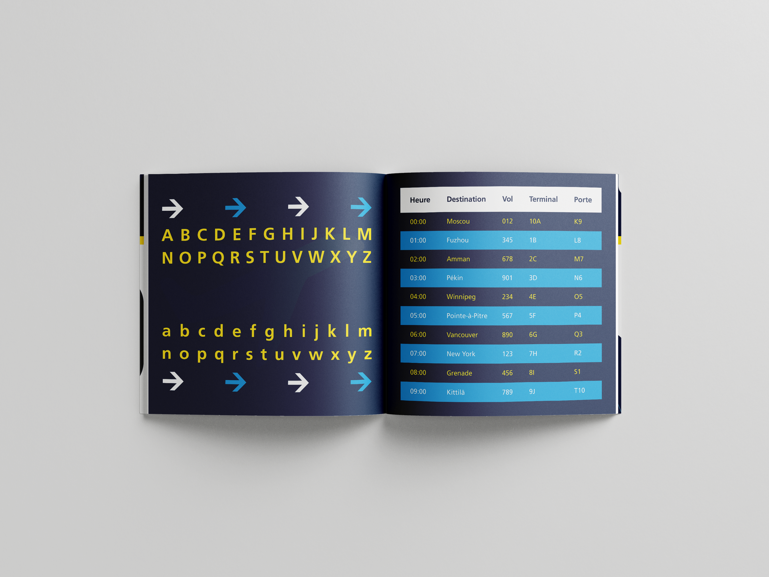
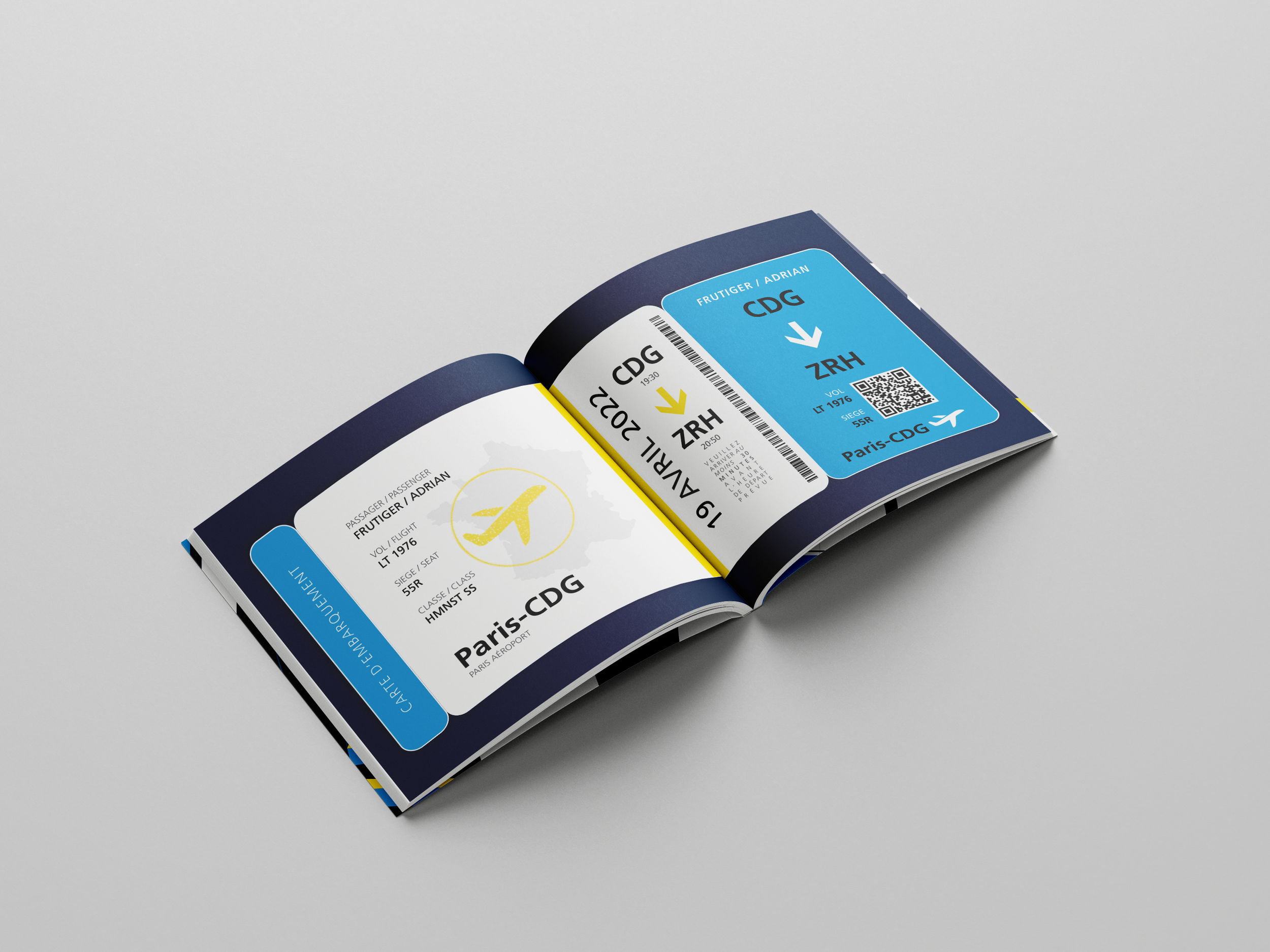
Frutiger was originally designed for the Charles de Gaulle Airport in Paris but has since appeared in logos for brands such as Polaroid and BANDAI NAMCO.
During research, I considered multiple thematic directions for the booklet:
Airport theme: Inspired by the CDG airport, where I had previously visited and collected reference images.
Swiss style: Reflecting Adrian Frutiger’s Swiss heritage and the principles of Swiss design.
Polaroid theme: Highlighting the colorful accents and branding of Polaroid logos featuring Frutiger.
I developed drafts for all three directions to explore new styles, expand my skillset, and create options for feedback. Each concept offered unique visual opportunities and helped me grow as a designer through iteration and critique.
design development
Switching between three distinct design directions was both challenging and rewarding. Feedback from peers and instructors informed each revision, guiding my decision-making while allowing me to experiment with composition, hierarchy, and visual storytelling.
This project was a turning point in my education, allowing me to express my creative voice and solidifying my passion for print and booklet design. It also laid the foundation for future personal projects in packaging and editorial design.
final direction
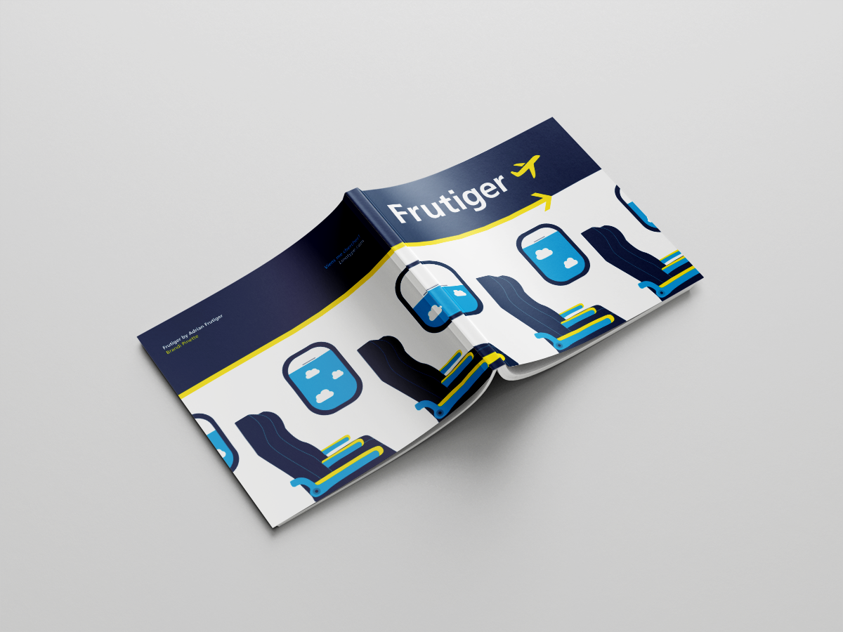
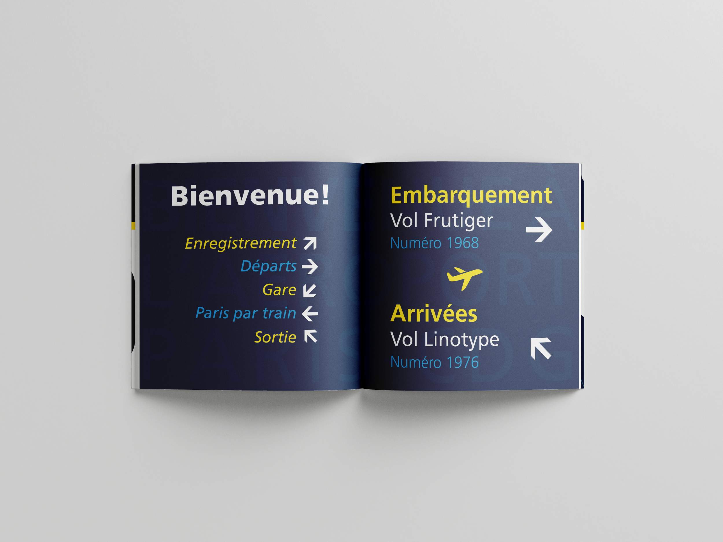
I ultimately chose the airport theme for its personal and aesthetic resonance. Having studied French for five years and visited Paris twice, the theme felt meaningful and authentic.
Format: 8x8" booklet, twelve fully designed pages
Design approach: Modeled after CDG airport wayfinding signage
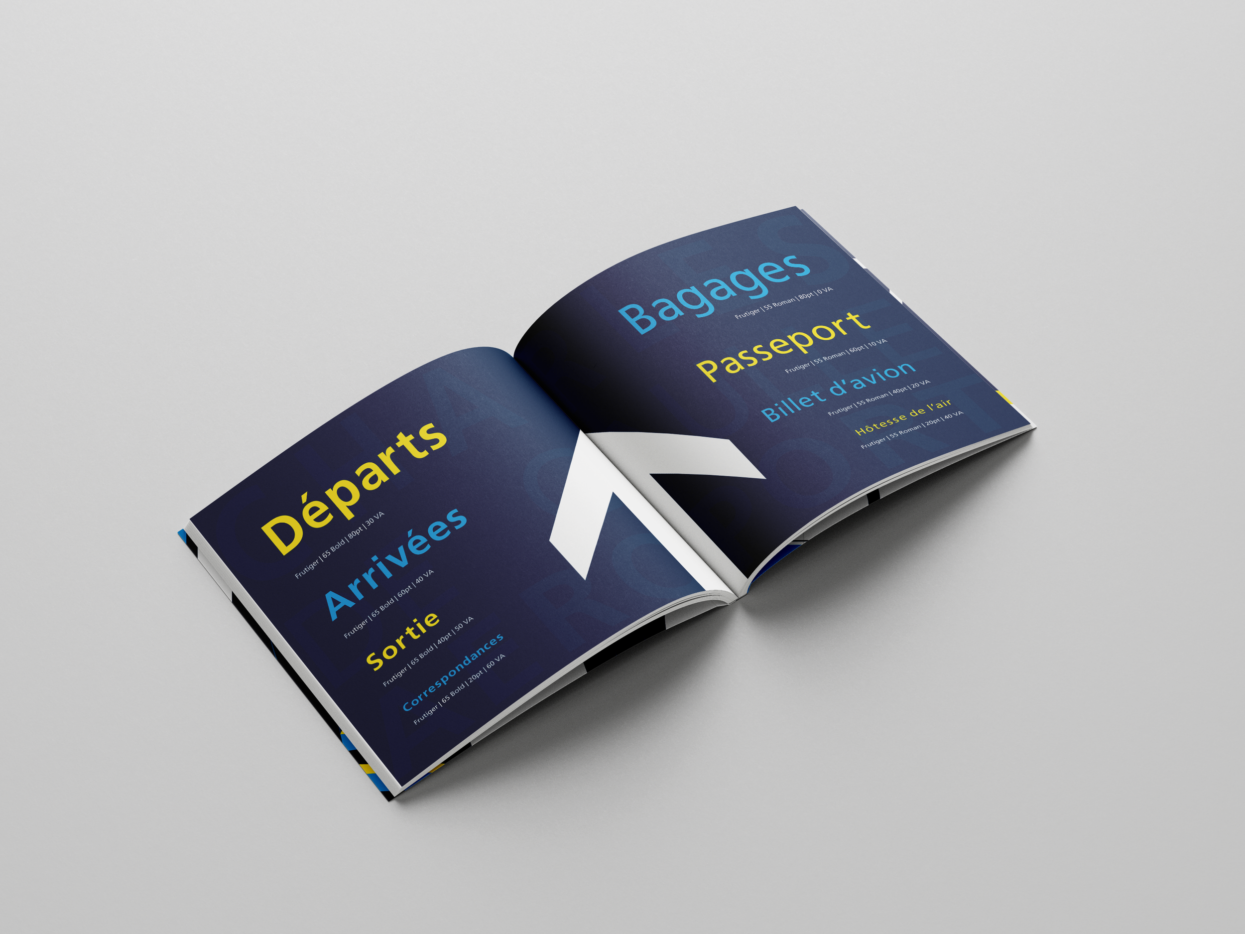
Tools: Illustrator for graphics, InDesign for layout, Pantone spot colors for print fidelity
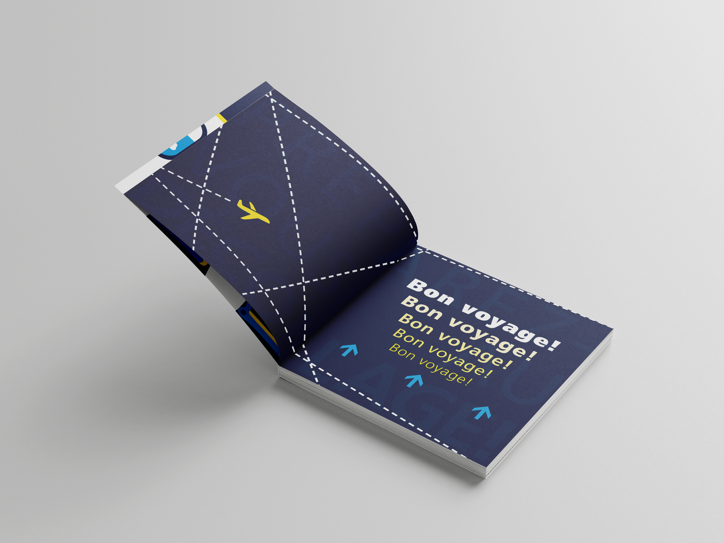
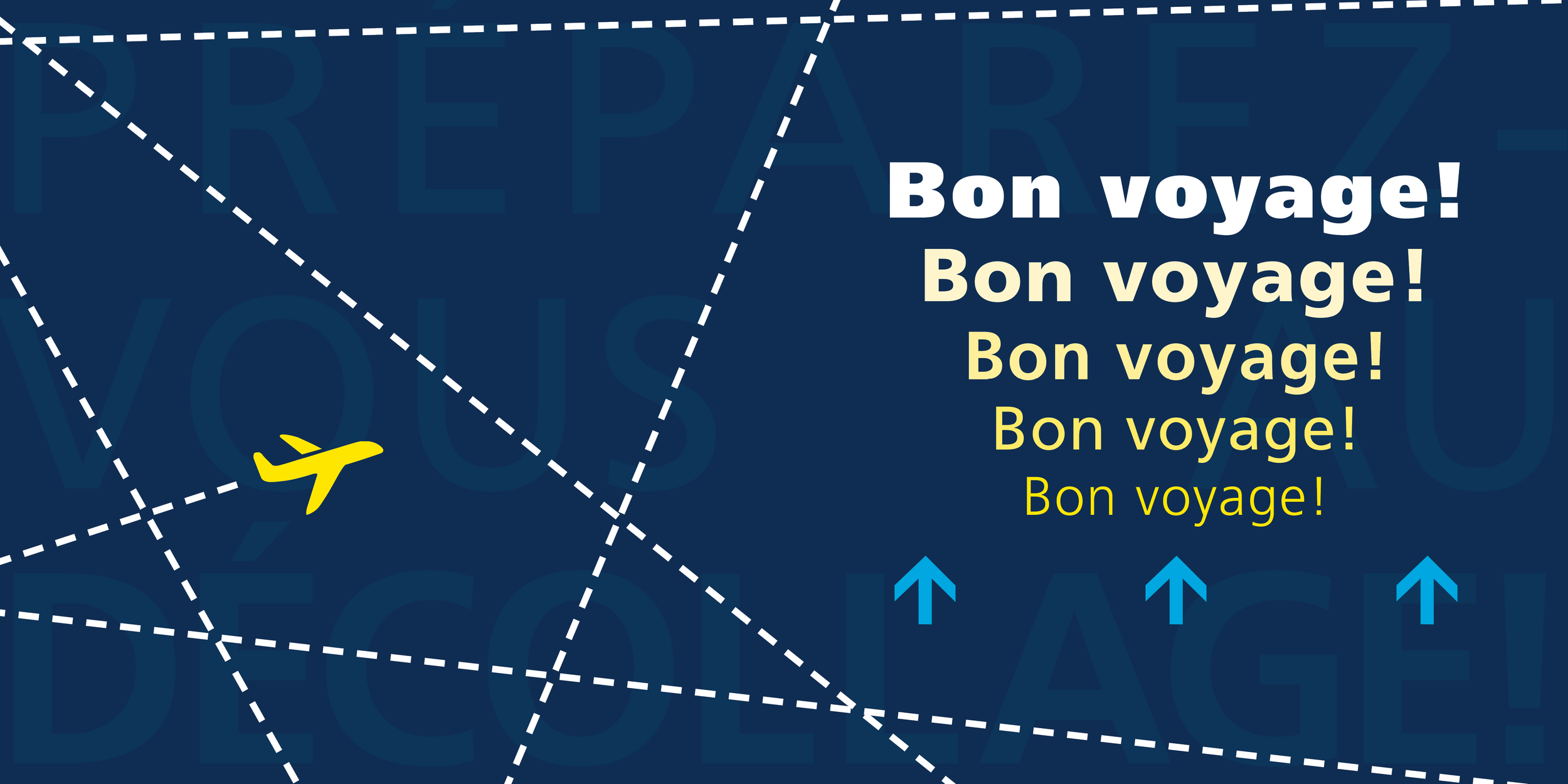
Cover: Front cover design wraps around to the back cover
Printing the booklet was especially rewarding after a period of mostly digital work during the pandemic. I iterated through printed drafts— cutting, taping, and testing layouts— to ensure the design translated beautifully to physical media. Seeing the finished printed piece reinforced my understanding of scale, color, and material in print design.